Table of Contents
When I first started designing websites, I thought success was all about aesthetics. But as I grew in my web design career, I realized there’s a deeper, psychological side to it. Every color, font, and layout choice influences how visitors feel and behave. If you’re thinking of getting a website made, it’s essential to understand the hidden power behind these design elements.
In this post, I’ll share how psychology shapes web design and how you can use it to create a website that doesn’t just look beautiful but also converts visitors into customers.

Hi there! I’m Karina, a web designer based in Rotterdam, and I specialize in helping small businesses like yours create websites that work. Over the years, I’ve helped countless businesses build their online presence, and I can tell you, having a well-made WordPress & Shopify website can be a game-changer, a Rotterdam-based web designer and founder of Design by Karina, where I create websites that make an impact.
The Power of Color in Web Design
Color is more than just decoration; it evokes emotions and influences decision-making. Think about the last time you saw a website that felt calming or exciting—it was likely because of its color scheme.


Emotional Triggers of Colors
- Blue: Trust and stability. It’s often used in finance or tech industries. During my time at Uber, we relied on blue for its calming effect.
- Red: Urgency and excitement. Think of flash sales or limited-time offers.
- Green: Health, balance, and nature. It’s popular for wellness brands and eco-conscious businesses.
For instance, one of my clients selling fancy lights in the Netherlands chose warm, inviting colors to make customers feel cozy. The results? A noticeable uptick in customer engagement.
Actionable Tips for Choosing Colors
- Know Your Audience: Are you targeting luxury shoppers or budget-conscious buyers? Each group responds to colors differently.
- Stick to a Palette: Use no more than 3-4 core colors to avoid overwhelming visitors.
- Contrast for CTA Buttons: Ensure call-to-action (CTA) buttons pop by using contrasting colors. If your site is predominantly blue, a bold orange CTA grabs attention.
Fonts: The Silent Communicators
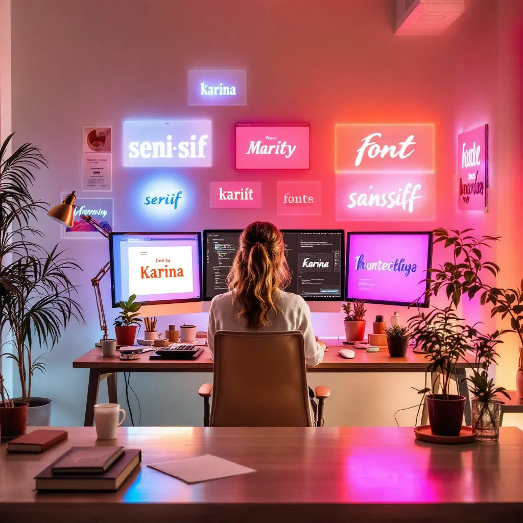
Fonts communicate personality. They set the tone for your website even before visitors read the first word.
Different Font Personalities
- Serif Fonts: Elegant and traditional (e.g., Times New Roman). Perfect for law firms or high-end brands.
- Sans-Serif Fonts: Modern and clean (e.g., Arial). These are popular for tech companies and start-ups.
- Script Fonts: Fancy and decorative. They can convey sophistication but should be used sparingly.
A Personal Experience
While working on Carolyn Adams’ website for her mammassage services, we opted for rounded, friendly sans-serif fonts. This choice aligned with her brand’s warm, nurturing vibe, making visitors feel at ease.
Tips for Font Selection
- Readability First: Fancy fonts might look good but can be hard to read. Ensure all text is legible.
- Pair Wisely: Combine two complementary fonts for visual balance—one for headings and another for body text.
- Consistency is Key: Use the same fonts across all pages for a cohesive experience.

Layouts: Guiding the User Journey
Your website layout should tell a story, leading visitors from one section to another effortlessly.
The F-Pattern and Z-Pattern
Studies show that users typically scan websites in an F or Z pattern:
- F-Pattern: Common on text-heavy pages. Users skim down the left side and across.
- Z-Pattern: Ideal for pages with fewer elements. It draws attention from the top left to the top right, down diagonally, and across to the bottom.
Designing for Flow
For Lindsay’s WayOff website, we used a sleek Z-pattern layout to highlight her key product categories and CTAs. The intuitive design increased click-through rates on the site.
Tips for Layout Optimization
- Prioritize Key Elements: Place your most important content (e.g., CTAs) where users are most likely to see them.
- White Space is Your Friend: Don’t cram too much on one page. White space gives users’ eyes a place to rest.
- Visual Hierarchy: Use size, color, and positioning to guide users’ attention.
How Trust Signals Impact Customer Behavior
Trust is crucial for conversions. When visitors land on your site, they need to feel safe before they take any action.
Building Trust Through Design
- Consistent Branding: Ensure your branding’s color scheme, fonts, and imagery remain consistent.
- Testimonials: Display reviews and client feedback prominently.
- Security Badges: If you’re running an e-commerce site, show SSL certificates or payment security icons.
One of my favorite trust-building moments happened when I redesigned WetWave’s website. Adding customer reviews and payment security badges immediately boosted their credibility.
Calls to Action: Nudging Customers Towards Conversion
Your CTAs should stand out and inspire action.
Characteristics of High-Converting CTAs
- Clear and Direct: Use action words like “Get Started,” “Shop Now,” or “Schedule a Call.”
- Urgency: Add phrases like “Limited Time Offer” to create FOMO (fear of missing out).
- Contrasting Colors: Ensure CTA buttons pop against the background.
For my client Tommy’s Kontio UK website, a simple tweak—changing the CTA button color—led to a noticeable increase in conversions.
Final Thoughts
Web design isn’t just about making things pretty; it’s about understanding how colors, fonts, and layouts influence human behavior. By applying these psychological principles, you can create a site that’s both visually stunning and effective at turning visitors into loyal customers.
If you’re thinking of getting a website made, or “website laten maken,” reach out! I’d love to help design a site that reflects your brand and drives results.
Have any questions or want to brainstorm ideas? Drop me a message—I’m here to help!
GET IN TOUCH
